My New Modern Farmhouse Dining Room Design
I cannot wait to show you the changes I have made in my dining room design. This space is so often used my my family and I always try to keep it as a cozy, inviting space that is stylish and up to date. Come check out what has changed!
Before we get started I want to let you know that this post is sponsored by Frame It Easy. All my opinions are my own, and I only recommend and feature products I truly believe in.
Over the past little while, I have been craving a bit of a change in my dining room design. When we built our home, there were a few things about my dining room that always bothered me. Now, they aren’t so huge of problems, but they were little things that drove me crazy.
Let me explain. We have a large window in my dining room. The window was placed according to what it looked like on the outside of the house…so it is not centered in the dining room. Now, this isn’t a huge deal. But, our chandelier was hung in the center of the room. Which means that the window and the chandelier do not line up. Still, this may not seem like a big deal.
When I add my dining table into the mix, its hard to decide where to center the table. Do I center it above the chandelier, and then the window is thrown off? Also, since we have incorporated our large vintage church pew into the dining room design, it has thrown off the location of the chandelier even more.
We decided that we needed to move the lighting in order to get the right layout in our dining room.
Lets see what our dining room design looked like before:

In addition to all that, I wanted to update my lighting situation in my dining room design. With the help of my husband we were able to take out the old light and replace it with 2 new lights from IKEA. My husband is a genius. He’s a plumber, an electrician, and so much more! He was able to change out the rough in boxes and create two instead of one.
We made sure to center them with the window as well as as with the table and our church pew, which shifted our table towards one side of the room. This all may seem silly so people, but for me, it was something that always bothered me, and with just a few simple changes we were able to fix it. Without tearing out the window and centering it in the room, this was the best way to go.
The dining room lights I chose for my dining room design:
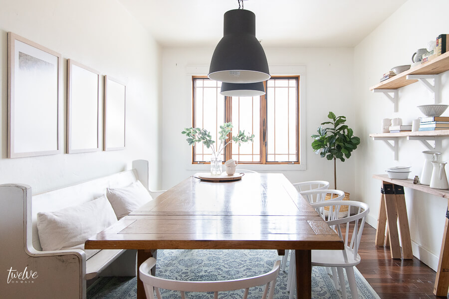
I went from a rustic, iron chandelier to a more modern set of IKEA pendant lights. We installed the IKEA Hektar Pendant Lights. We installed the 19 inch lights which are the largest ones they made.

I am totally obsessed with these lights. Not only are they affordable but they look perfect in my dining room. My modern farmhouse dining room is taking shape.
Shedding some weight with my dining room design:
As the spring starts to approach on my side of the world, I was in dire need to freshen up and lighten my load. This meant it was time to take a new approach. I took my curtains out!
Since I can remember, we have always loved having curtains in our home. I often change them out and feel like they give a lot of texture and softness to a space. BUT, I was ready to shed that weight. My wood windows needed to shine and I wanted to be able to see them and enjoy them.

Instantly the room felt brighter and more clean. The winter blues are becoming a thing of the past.
I would say that the goal for my dining room update was to purge, and choose only items I loved to fill the space. That was harder than I thought it would be. That process involved taking everything out, and only adding the things in that I truly wanted.
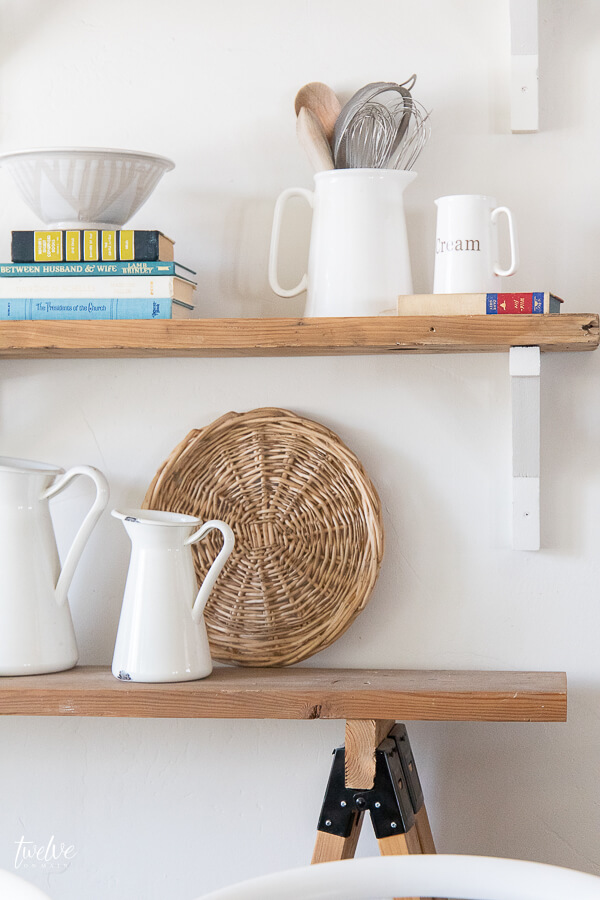
I spent some time styling my shelves as well…


Now lets address the wall decor…I was really only interested in some framed wall art….lets talk about what I used.
Choosing framed artwork for my dining room design:
This was a big change in my dining room. Previously I had a large chalkboard above my church pew, but I had definitely outgrown it. I was yearning for some new artwork, something a little more grown up.
Having some professionally framed family pictures in my home has been a goal for some time. I was thrilled when I came across Frame It Easy. Frame It Easy is a website that you can use to customize your framed art exactly to your preferences.
How many of you have had family photos taken and then they just sit there on that digital file and never make it to your walls? What about that gorgeous art print you ordered, but never got around to framing?
I think the biggest problem for people, including me, is that its hard to find specific frame sizes in big box stores and custom framing artwork can be really pricey.
Frame It Easy is different. You can get custom made framed artwork for less! Its a simple 4 step process.
- First, you pick the size you want your frame and artwork to be. You can customize this to be any size you want. At this point you will choose to either add artwork (in a digital download) or if you already have the artwork or photos printed off you can choose not to include a print. The nice thing about this step is that the website will alert you if the digital file is not large enough for what you want to print out. This ensures you get a high quality print
- Second, you will choose the style of frame that you want. They have tons to choose from. I chose black for some of mine and a natural wood for the ones in my dining room.
- Third, you can choose the mat options. For the prints in my dining room, I chose to do an offset mat. This isn’t an actual cut mat, though. I used a tutorial on Frame It Easy’s website that shows you how to create the offset look using Canva(a free design website) or Photoshop. If want traditional matting, you can choose the width and also choose if you want single or double matting options. Plus they have tons of mat colors to choose from.
- Finally, you will choose your cover option. Frame It Easy uses a acrylic glass alternative that is safe and easy to ship. You can choose from clear or non-glare glass. I chose non-glare glass for my framed prints.
Want to see what my framed prints looked like as they came out of the box? Check out my Facebook Live Unboxing video:
So, lets have a look at what my new framed photos look like in my dining room. I chose to do a triptych set, which is a set of three framed pieces together.

They have been hung above my church pew. I wanted to balance the shelving on the opposite wall. Gosh, they are so pretty!


They are the perfect addition to my dining room design! The natural wood frames keep it light and compliment the colors in the photos.
I am super happy with how they turned out and cannot wait to make my next order.

And get this! Frame It Easy is offering all my readers 10 percent off their order! Simply use the code:
TWELVEONMAIN
to redeem it!
Now I want to share a few more items I changed up to finish my new modern farmhouse dining room design.

I got new chairs to go around my farmhouse dining table. I have been looking to replace our dining chairs for years. We were down to only 2 of our original chairs(all the others had broken). I had covered them with chair covers just to conceal the ugly look of them. But it was time.

I chose a Safavieh American Homes Collection Blanchard Country Farmhouse White Spindle Side Chair. I have been so in love with these chairs and love how they look. And not only do they look great but they are so comfortable! I was really worried about that, but even my husband,who is always skeptical was really happy with how comfortable they were! They are bigger than I thought they would be so they are great to sit in and be able to move around.
The last thing I added to my dining room design is my Mohawk Heirloom Seti Area Rug. I used to have this in my living room but I think it looks great as a base to my modern farmhouse dining room design. I hopped between this one and a black and white one, but in the end, the pop of color was a nice addition.

In the end, I am sooooo thrilled with out my new dining room design turned out! Each and every element I added into the room is something I carefully chose. I have found that when I force myself to edit down and only add the things I really love, I am more content and pleased with the design. My dining room now has a modern fixer upper style to it.

This is the first time in a long time that I have family pictured framed on the wall. I have put it off for so long, and I love sitting at the dining table, playing a card game with my family and seeing those faces on the wall looking back at me.


Afterall, this is why I do all this. I don’t create spaces like this so that I can solely enjoy it. These spaces are for my children and for my husband. I love seeing them enjoy the space too. Its hard work but its worth it to give them a place to come home to that fills them with joy too.
So what do you think of the changes? I am so very happy with it and feel like this will last a long time. Of course, I will always be changing odd items in and out…its just my nature. But my new chairs, my awesome new framed photos, and my new lights…they have completely changed the space.
I look forward to spending many nights playing games here with my kids. We love it.
If you want to see more of the room makeovers in my home check out these posts:
One Room Challenge- Farmhouse Laundry Room Reveal!
My Budget Friendly Bathroom Makeover | Reveal
Farmhouse Master Bathroom | Final Reveal
The Ultimate Farmhouse Bedroom Decor Ideas
Make sure you SHARE this post! Sharing truly is caring when you are a blogger! I am grateful for each and every share! To make it easy, simply PIN this image below to your Pinterest account!

I hope you have a great day!



It is a lovely room and so are those pictures. I like your chair and bear windows, its a nice place to eat, but i must admit i really like the sign that said ” Today’s Special” that was so cute and really made me laugh, thanks.
Thanks for the article
I will decorate my dining room in this way
I love everything about twelveonmain. Thank you for the beautiful printables….I can’t wait to incorporate them into my decor.